
Transactional Kiosk
Transactional Kiosk
Transactional Kiosk
Retail
Retail
Retail
FMCG
FMCG
FMCG
Designing Logic Vapes’ Transactional Kiosk
Designing Logic Vapes'
Transactional Kiosk
Designing Logic Vapes’ Transactional Kiosk
Designing Logic Vapes' Transactional Kiosk
Delivered guided flows that made checkout 46% faster.
Delivered guided flows that made checkout 46% faster.
Delivered guided flows that made checkout 46% faster.
Role
Product Designer
Role
Product Designer
Role
Product Designer
Role
Product Designer
Team
Developer, User Researcher
Product Owner, Copywriter
Team
Developer, User Researcher
Product Owner, Copywriter
Team
Developer, User Researcher
Product Owner, Copywriter
Team
Developer, User Researcher
Product Owner, Copywriter
Responsibilities
UX/UI Design, Usability Testing
In-Store Observation
Responsibilities
UX/UI Design, Usability Testing
In-Store Observation
Responsibilities
UX/UI Design, Usability Testing
In-Store Observation
Responsibilities
UX/UI Design, Usability Testing
In-Store Observation
Animated sequence showcasing the Logic Vapes logo with clean, fluid motion.
Animated sequence showcasing the Logic Vapes logo with clean, fluid motion.
Animated sequence showcasing the Logic Vapes logo with clean, fluid motion.
Context & Challenge
Logic Vapes was losing in-store sales as customers abandoned purchases due to long queues, unclear product info, and a messy age-verification process. The staff only checkout created frustration, drop-offs, and compliance risk. I was tasked with designing a self-service kiosk that made purchasing faster and clearer while staying fully compliant which boosted conversions and easing staff pressure.
Key Impact
📈 +29% sales uplift in product lines
😀 85% post-launch user satisfaction
⚡ 46% faster checkout experience
Key Impact
📈 +29% sales uplift in product lines
😀 85% post-launch user satisfaction
⚡ 46% faster checkout experience
Key Impact
📈 +29% sales uplift in product lines
😀 85% post-launch user satisfaction
⚡ 46% faster checkout experience
Key Impact
📈 +29% sales uplift in product lines
😀 85% post-launch user satisfaction
⚡ 46% faster checkout experience
Key Impact
📈 +29% sales uplift in product lines
😀 85% post-launch user satisfaction
⚡ 46% faster checkout experience

Research & Insights
As the brief was fairly ambiguous I conducted in‑store observation and interviews with customers and staff which involved shadowing transactions across locations and peak times.
Through mapping the end‑to‑end journey; I surfaced four key pain points:
Slow, confusing checkout causing late stage drop‑offs
Unclear product details leading to hesitation
Poorly timed age verification causing failed transactions
Cluttered touchscreen UI with small tap zones and inconsistent states
These insights reframed the kiosk from "digital catalogue" to "guided, compliant checkout assistant" that needed to balance speed, education, and regulation.

Animated idle screen and primary menu interface for a retailer kiosk.
Animated idle screen and primary menu interface for a retailer kiosk.
Animated idle screen and primary menu interface for a retailer kiosk.
Animated idle screen and primary menu interface for a retailer kiosk.
Framing The Problem
From the research, I framed a clear problem: customers were abandoning purchases due to long queues, unclear product information, and a late age‑verification step, which hurt sales and increased compliance risk.
I aligned on three goals: reduce kiosk checkout time, increase completed transactions, and improve satisfaction with the in‑store experience.
I formed three hypotheses: moving age checks to the start and streamlining steps would reduce late drop‑offs; mirroring how staff guide choices; and a simpler UI with larger touch targets would enable more self‑served checkouts.

Flow & Interaction Design
I redesigned the self‑service journey to match how people naturally shop: confirm eligibility first, guide choices simply, and minimise friction on the way to payment. I partnered with hardware, retail operations, and engineering so the physical kiosk and digital experience worked as one in‑store system.
Moved age verification to the start of the journey to remove ineligible users early and prevent failed transactions
Introduced category‑first navigation that mirrors how staff guide purchases, while reducing steps by combining actions and cutting redundancy
Together, these changes created a faster, clearer flow with more completed sales and higher customer confidence
Flow & Interaction Design
Moved age verification to the start of the journey to remove ineligible users early and prevent failed transactions
Introduced category‑first navigation that mirrors how staff guide purchases, while reducing steps by combining actions and cutting redundancy
Together, these changes created a faster, clearer flow with more completed sales and higher customer confidence
Flow Architecture:
I redesigned the self‑service journey to match how people naturally shop: confirm eligibility first, guide choices simply, and minimise friction on the way to payment. I partnered with hardware, retail operations, and engineering so the physical kiosk and digital experience worked as one in‑store system.
Flow & Interaction Design
I redesigned the self‑service journey to match how people naturally shop: confirm eligibility first, guide choices simply, and minimise friction on the way to payment. I partnered with hardware, retail operations, and engineering so the physical kiosk and digital experience worked as one in‑store system.
Moved age verification to the start of the journey to remove ineligible users early and prevent failed transactions
Introduced category‑first navigation that mirrors how staff guide purchases, while reducing steps by combining actions and cutting redundancy
Together, these changes created a faster, clearer flow with more completed sales and higher customer confidence


Early kiosk flow and layout sketches used to define the initial solution.
Early kiosk flow and layout sketches used to define the initial solution.
Early kiosk flow and layout sketches used to define the initial solution.
Early kiosk flow and layout sketches used to define the initial solution.
Prototyping & Testing
Using Figma, I created mid‑fidelity wireframes to align product, compliance, engineering, and retail stakeholders and to iterate quickly on copy, layout, and interaction patterns. Usability testing led to clearer, low‑friction age‑verification prompts and streamlined product selection screens focused on a small set of comparison attributes, which reduced decision fatigue, cut errors, and increased task completion speed and confidence.

Low-fi wireframes outlining the kiosk journey across age gating, product browsing, and purchase steps.
Low-fi wireframes outlining the kiosk journey across age gating, product browsing, and purchase steps.
Low-fi wireframes outlining the kiosk journey across age gating, product browsing, and purchase steps.
Low-fi wireframes outlining the kiosk journey across age gating, product browsing, and purchase steps.
Education, Content & Environment
Educational Content
Added ultra‑short, skippable explainers for compatibility, nicotine strength, and safety, replacing dense text with visual, contextual tips at decision points to keep decisions quick, with a trade‑off of prioritising essential information over detail to maintain speed at the shelf.
Hardware & Environment Optimisation
Defined kiosk screen size, height, and angle for accessibility and visibility, and specified durable, responsive touchscreens to support a large, high‑contrast UI, pausing nice‑to‑have hardware features to invest in reliability and ergonomics with higher conversion impact.

Hi-fi product screens with a smooth carousel and tabs for exploring different product types.
Hi-fi product screens with a smooth carousel and tabs for exploring different product types.
Hi-fi product screens with a smooth carousel and tabs for exploring different product types.
Hi-fi product screens with a smooth carousel and tabs for exploring different product types.
Leadership & Collaboration
As lead designer on the project, my responsibilities went beyond screens:
Design Ownership
Set the UX direction for the end‑to‑end flow, negotiated trade‑offs (e.g., where to place legal content, what to include on‑screen vs. in staff training), and made final calls on navigation and information hierarchy.
Artefact Coaching
Used user journeys and annotated flows to help non‑design stakeholders understand the impact of design choices.

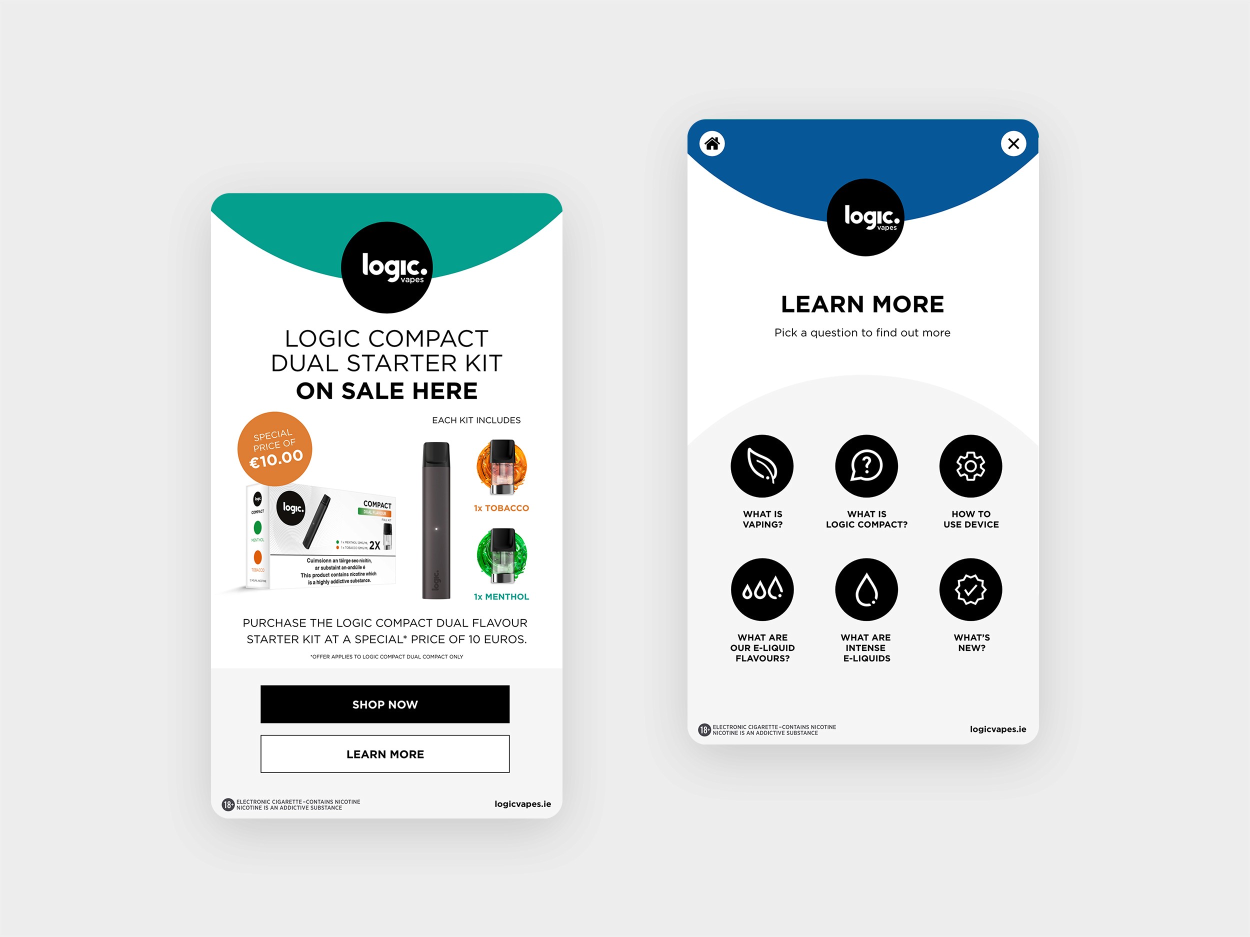
Hi-fi kiosk screens showing the idle animation, starter-kit promotion, and a learn-more section.
Hi-fi kiosk screens showing the idle animation, starter-kit promotion, and a learn-more section.
Hi-fi kiosk screens showing the idle animation, starter-kit promotion, and a learn-more section.
Hi-fi kiosk screens showing the idle animation, starter-kit promotion, and a learn-more section.
Pilot, Iteration and Impact
After pilot deployment, I monitored qualitative feedback and operational metrics with stakeholdes, then iterated on:
Age Check Placement
Minor copy and visual tweaks around the upfront age gate further reduced confusion and abandonment.
Navigation & Labelling
A clearer category‑first structure and improved labelling simplified wayfinding and reduced backtracking.
UI Responsiveness
Adjustments to button states, error feedback, and loading indicators improved perceived speed and trust.
Pilot, Iteration and Impact
After pilot deployment, I monitored qualitative feedback and operational metrics with stakeholders, then iterated on:
Age Check Placement
Minor copy and visual tweaks around the upfront age gate further reduced confusion and abandonment.
Navigation & Labelling
A clearer category‑first structure and improved labelling simplified wayfinding and reduced backtracking.
UI Responsiveness
Adjustments to button states, error feedback, and loading indicators improved perceived speed and trust.
Pilot, Iteration and Impact
After pilot deployment, I monitored qualitative feedback and operational metrics with stakeholdes, then iterated on:
Age Check Placement
Minor copy and visual tweaks around the upfront age gate further reduced confusion and abandonment.
Navigation & Labelling
A clearer category‑first structure and improved labelling simplified wayfinding and reduced backtracking.
UI Responsiveness
Adjustments to button states, error feedback, and loading indicators improved perceived speed and trust.
Animated walkthrough showing the flow from idle screen to product purchase.
Animated walkthrough showing the flow from idle screen to product purchase.
Animated walkthrough showing the flow from idle screen to product purchase.
Animated walkthrough showing the flow from idle screen to product purchase.
Hi-fi kiosk screens showing the idle animation, starter-kit promotion, and a learn-more section.
Hi-fi kiosk screens showing the idle animation, starter-kit promotion, and a learn-more section.
Hi-fi kiosk screens showing the idle animation, starter-kit promotion, and a learn-more section.
Hi-fi kiosk screens showing the idle animation, starter-kit promotion, and a learn-more section.
What I learned
This project reinforced that:
Simple, compliant UX grounded in real behaviour can unlock significant commercial impact, especially in regulated retail.
Early collaboration with compliance and hardware teams prevents rework and helps turn constraints into design primitives rather than blockers.
If I tackled this again, I would:
Run more extensive accessibility audits earlier to ensure the kiosk works for a broader customer size.
Integrate analytics from day one to track drop‑off points and run ongoing experiments on copy, layout, and content, treating the kiosk as a continuously optimised product rather than a one‑off deployment.
Key Impact
📈 +29% sales uplift in product lines
😀 85% post-launch user satisfaction
⚡ 46% faster checkout experience
Key Impact
📈 +29% sales uplift in product lines
😀 85% post-launch user satisfaction
⚡ 46% faster checkout experience
Key Impact
📈 +29% sales uplift in product lines
😀 85% post-launch user satisfaction
⚡ 46% faster checkout experience
Key Impact
📈 +29% sales uplift in product lines
😀 85% post-launch user satisfaction
⚡ 46% faster checkout experience
